The Art of Elysium
The science-fiction film Elysium opens today in theaters around the country. Starring Matt Damon & Jodie Foster and written/directed by Neill Blomkamp (who also did the excellent and wrenching District 9), it explores the consequences of future technologies on an Earth rivened by inequality - perhaps an advert for a high orbit Occupy movement. As the trailer makes clear, this dystopian future has the one-percenters enjoying fine living and good health on the space settlement Elysium while the rest of humanity suffers deprivation, hunger, and pollution of the sort that Paul Ehrlich (The Population Bomb, 1968) and the Club of Rome (The Limits to Growth, 1972) warned about.
I haven't seen the film yet but I've watched the trailer several times. I was immediately struck by similarities in the depiction of Elysium - both inside and from the outside - to designs associated with Gerard O'Neill's concepts for space colonies in the 1970s. In a draft of The Visioneers, I wrote about artists' conceptualizations of O'Neill's ideas but I ended up having to cut a lot of this material to meet the word count specified in my book contract. The release of Elysium spurred me to go back to this material and re-think it some. So, let's take a look...
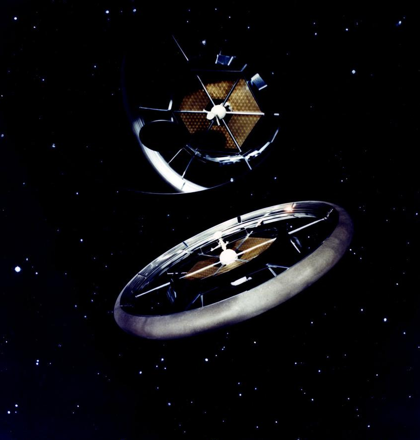
In the film's trailer, we see a rocket ship approaching a torus-shaped space settlement: This, of course, resembles wheel-shaped space stations that hark all the way back to Chesley Bonestell, von Braun, and Kubrick's 2001, if not earlier. This design - known as the Stanford torus - was familiar to O'Neill and his supporters:
As we zoom closer, we see Elysium in more detail:
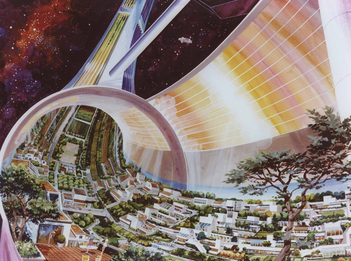
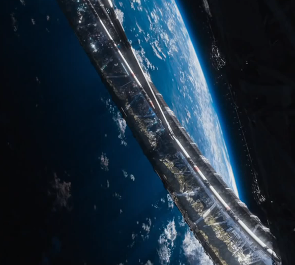 Compare this with a painting done by Rick Guidice in 1975 for a summer study of space settlements at NASA's Ames Research Center in the Bay Area:
Looks similar, right?
So- what was this "summer study?" This was based at the Ames Research Center, NASA’s facility in the Bay Area, and Stanford University. NASA (or, more accurately, that part of the agency which physicist Freeman Dyson has called the “paper NASA” as opposed to that part of NASA which bends metal and actually builds things) provided funding to help support the study as did the American Society for Engineering Education.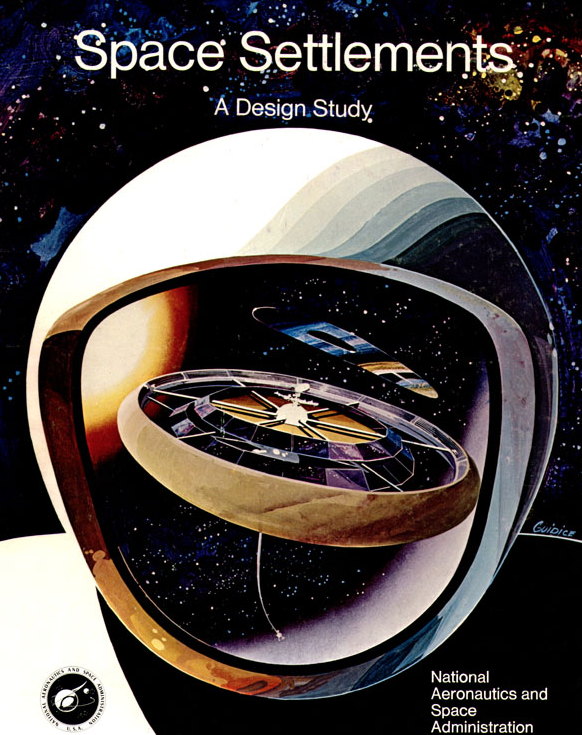 What started in 1975 as pedagogical exercise for students grew into a full-blown ten week design study as an interdisciplinary group of some few dozen engineers, physicists, social scientists, and students started with O'Neill’s basic concepts and improved on them. Study participants also worked out detailed schedules, budgets, and milestone charts for accomplishing the entire system. Guidice was a freelance illustrator who often did advertising work; his artwork, designed to sell the future of space exploration, was another product from the summer study. ((An on-line essay by Veronique Greenwood for DiscoverMagazine.com discusses this. Greenwood interviewed me at length for her piece and I shared a host of materials with her.)) (More of Guidice's space art is here. The granddaddy of all space art is, of course, Chesley Bonestell - here is an excellent look at his work.)Participants in the 1975 Stanford-Ames study were interested in what living on a space settlement might be like (as opposed to just designing one) and considered the sorts of agriculture and animal husbandry that might make the most ecological sense. The curiosity some study participants had for communal living and libertarian-oriented governments blended with questions about the social and psychological effects of long-term space habitation. Would, for example, living in space be akin to shimanagashi – a form of banishment used during feudal Japan?Moving inside Elysium where an international assemblage of the future's movers and shakers resides, we see:
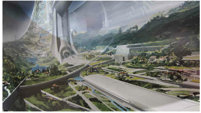
and this:
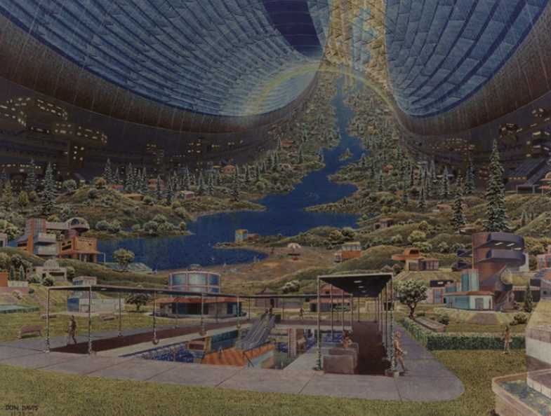
It's impossible not to see the close resemblance to a 1975 piece by another illustrator, Don Davis:
Davis came of age with the Apollo program and worked as a scientific illustrator for the US Geological Survey’s Branch of Astrogeological Studies. Davis also did the black and white artwork that appeared in O'Neill's award-winning 1977 book The High Frontier. Like O'Neill described in his 1977 book The High Frontier, life in a space colony would be environmentally benign. Farming and manufacturing areas would be separated from residential areas, the result being an idyllic landscape characteristic of some 19th century small town. O'Neill - a high energy physicist and professor at Princeton - spent a good amount of time in the Bay Area working at Stanford's linear accelerator center. He was an enthusiast for coastal California's landscape so it's not surprise that some of this filtered into images for his space settlements:
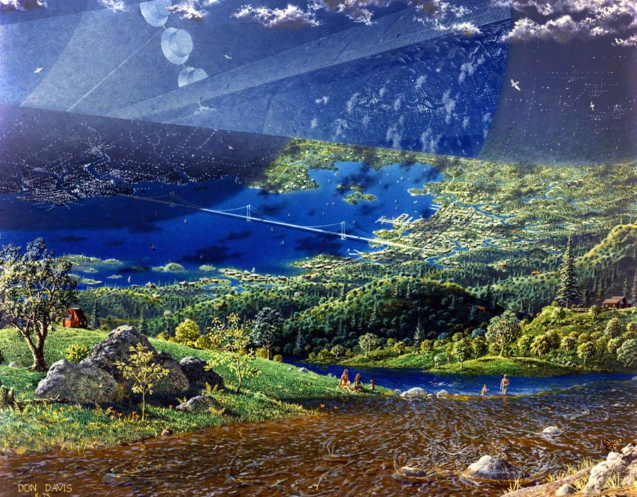 Should we be surprised to see images of space settlements painted four decades ago appearing in big-budget films like Elysium? I don't think so. Images by artists like Guidice and Davis were widely reproduced in books and magazines from 1975 onwards and were especially visible to sci-fi and space buffs. Moreover, there has been a small flurry of on-line essays (here and here and here) about the "art of space settlements." It would be more surprising if the artists and designers working on Elysium hadn't seen them.What interests me most as a historian is that paintings by people like Guidice and Davis are visualizations of a possible future and therefore have political implications. O'Neill believed not just in the power of these images but in the underlying physics and engineering that made them realistic. In a recent interview, Davis noted that "Gerry O’Neill was very matter-of-fact minded. He was not a far-away dreamer at all. His mathematics and knowledge of processes involved tended to make the idea very convincing as you discussed it in detail with him."Elysium's trailer makes it clear that the film's protagonist wants to escape a crowded and polluted planet - the very sort of scenario which inspired O'Neill to imagine moving large numbers of people off-world. The mini-Spaceship Earths that O'Neill imagined people might be able to build one day would be able to experiment with all sorts of political and social systems.Critics of O'Neill's ideas derided their inherent elitism - a Space Age version of white flight. When underground comic artist R. Crumb accepted an invitation from Stewart Brand to attend California's first Space Day (“or whatever the hell it was called,” Crumb wrote) in 1977, he described space advocates as just a “smug bunch of hypocrites.” Fifteen years later, critics derided the libertarian-infused ideology of the dot.com cohort as selfish, elitist, and childish. Critics have likewise attacked transhumanism. “The Singularity is not the great vision for society,” one observer said, “It is rich people building a lifeboat and getting off the ship.” ((Andrew Orlowski quoted in Ashlee Vance. “Merely Human? That's So Yesterday.” The New York Times, June 11, 2010, B1.)) Elysium looks like just such a lifeboat, full of rich, healthy, well-fed, and long-lived people.When director Blomkamp was asked by Entertainment Weekly if the film was about the future, he responded: "This isn't science fiction. This is today. This is now." A lesson to take away from O'Neill's sidetracked visioneering and today's transhumanism is that we need a more inclusive vision for the future, especially if radical visions for it are going to be anything more than paint on canvas.[After-the-fact note: Today's New York Times has a good review of Elysium. At the end, Manohla Dargis comes to somewhat similar conclusions -- "...its banality is further evidence of how difficult Utopian visions, even caricatures like this one, have become for filmmakers to imagine."]

